WAR Roster Builder 3.0 Explainer
A few months ago, I debuted a WAR Roster Builder, a fun tool that allowed the user to build their ideal NHL roster and would estimate how that team would perform using projected Wins Above Replacement. Recently, I’ve worked on sharpening those projections and applying them to real team rosters, something which many people had asked for. Using these projections, I’ve been posting standings projections for the upcoming season based on this tool, which has been mostly fun even if it’s made me some lifelong enemies.
To access the Roster Builder, my player cards, and more, support my work on Patreon.
With the season coming up, I thought I would take the opportunity to explain where these numbers come from, how they’re calculated, and how to interpret them. This will lead into my divisional preview articles which I will publish next week.
The most important thing to note here is that I do not believe these projections are absolutely guaranteed to happen, totally airtight, and scientifically rigorous. As every fan knows, hockey is extremely variable, and nobody predicts the season right. Injuries happen. Players break out. Goalies exist. The outputs of this tool should be interpreted as an educated guess and a conversation starter, and maybe lead you to take a second look at a team you’ve underestimated or overestimated. They should definitely not be treated as me thinking I am absolutely Correct about where every team will be ranked or that “well I guess there’s no need to play the season now that mister math has figured it all out!”
The WAR model here was built by Patrick Bacon (a.k.a. TopDownHockey), and conceptually similar tools and visualizations have been used by Dom Luszczyszyn and Sean Tierney.
The Basics
The WAR Roster Builder is not a simulation model. Unlike other projections you might see (from sources like Dom Luszczyszyn, Micah McCurdy, and Sean Tierney for example), the standings and point projections are based on a projected full-season Wins Above Replacement provided by each player in a certain amount of ice time determined by their spot in the depth chart. It exists in a beautiful world with no injuries, midseason trades, or unexpected demotions. Using historical data I figured that the average uninjured full season even strength TOI for lines/pairings were:
First Line: 1277 minutes
Second Line: 1089 minutes
Third Line: 1005 minutes
Fourth Line: 838 minutes
Top Pair: 1550 minutes
Second Pair: 1425 minutes
Bottom Pair: 1215 minutes
The even strength WAR values for each player were determined using a weighted average of the last three seasons of data in each of the things that the WAR model measures: a player’s impact on offensive and defensive scoring chances, their finishing ability, and their impact on their team’s penalty-taking and -drawing when they’re on the ice. The weighting for each of these components was determined by a regression analysis to maximize predictiveness. Some favour the most recent season quite heavily, like offence, while some perform best over a larger sample like shooting. Only seasons in which a player played over 200 minutes at even strength are included in this analysis. These are combined into a projected “WAR per minute” at even strength, which is multiplied by the projected minutes played.
I chose to use CapFriendly’s depth charts as the reference for NHL teams, as it is very accurate and frequently updated. As teams make trades or acquire new players, they will update automatically. If the depth chart includes a player who did not play 200 TOI in the 2019-20 season, that player will be presumed to be replacement-level (i.e. their WAR will be zero in all facets). Considering how unpredictable rookies can be (cough), I decided this was a safer option than trying to project them. This might shortchange Kaprizov, Lafreniere, and Sorokin, for example, but also we really don’t know how those guys are going to play next season and I feel unqualified to just guess and put my finger on the scale like that.
Reading the Projections
Forwards
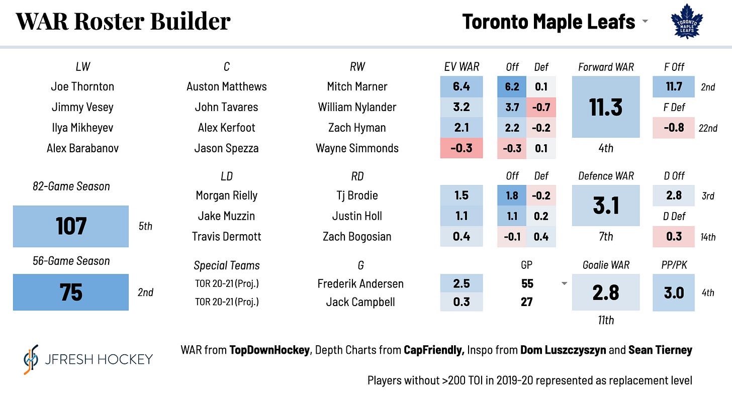
Here’s the output for a forward group. There are a number of things you can glean from this.
EV WAR: Under “EV WAR”, you see the projected even strength wins added by each line. The colours show how that line compares to others in the league. So this team has a solid top six (an average first line and above-average second line) but a poor bottom six.
Off and Def: This splits that WAR value into offence (which includes scoring chance driving and finishing) and defence. This gives you extra insight, because you can see that the top two lines are excellent offensively but give a lot back with poor defence.
Forward WAR: This adds up all the lines’ WAR and shows you how that forward ground ranks compared to the rest of the league.
F Off and F Def: This adds up all the lines’ offence and defence WAR and shows you how they rank compared to the rest of the league. So this team is 6th in forward offence but almost last in defence.
Defence
The defensive stats work the same way as the offensive ones do, with the sole exception that finishing talent is taken out of the equation (because it’s essentially random for defencemen). So from the above, you could glean that this is a poor defensive team aside from their elite middle pairing.
Goalies
If you’ve read my stuff before, you know that I am a firm believer that goaltender performance is basically a crapshoot, no matter what stat you use. Repeatability tests for WAR/minute for goalies came out with bizarre results, as I expected. So goalie projections are based on a more intuitive weighting of the past three seasons’ performance. Starting goalies are expected to play around 65% of their teams’ games. Within the roster builder, you are able to change the share of GP for a specific team as well.
Special Teams
Special teams are projected using a similar method - I use DailyFaceoff and other sources to estimate a team’s PP and PK lines, and apply players’ projected PP and PK WAR/60 respectively, weighted based on how many special teams minutes they are expected to play.
Standings Point Estimates
In an 82 game season, TopDownHockey’s model projects a “replacement level” team at 67 points. So quite simply, the team’s projected WAR is added to 33.5 and multiplied by two. The projection for the shortened season is different. Teams are playing not only fewer games, but they’re only playing against eachother. To handle this, results within the division are scaled based on the understanding that a limited number of total divisional points are available. The loser point adds some complication to this, so I just assumed that the recent historical average of games which go to overtime would apply here. What this means is that if, all other things even, a certain team in a division gets better, the rest of the teams will see a slight decline in their projection. The inverse is true as well. While this is obviously different than a simulation which literally pits these teams against eachother, it does address the issue of relative team strength in a way that I’m satisfied with.
Lineup Cards
This is something new that I decided to add leading into the new season because I thought it would be a fun way to condense 30 vicious arguments into one place. These cards rank a team at even strength in 30 different ways based on their projections and current depth chart.
Conclusion
So that’s how this thing works. I’ll be posting divisional previews in the next week as we build up (finally) to the start of the new season, as well as some articles looking at potential break-out candidates, players who could be bound for some statistical regression, and trophy predictions.


